

TRNK is a New-York based design studio and curatorial platform that launched a new brand identity in March 2022. I worked with the owner and creative director, Tariq Dixon, to create a high-level content strategy to complement its redefined brand ethos.
My Role
Content Design
Copywriting
Photography
Team
Tariq Dixon
Alyssa Nguyen
Deliverables
Literature
Branded content
Photography
Publicity
Birds-eye view
My process prioritized flexibility in order to adapt to TRNK’s changing needs. After the first photoshoot in December 2021, Tariq contacted me in February to ideate the content structure and progression for prospective social media posts and journal entries.


Transposition
My work was aimed at working professionals aged 30+ years. Whether interior designers or furniture enthusiasts, TRNK attracts a well-informed crowd who’s keen to keep up with the design world. Mindful of this user group, I consulted the original creative brief I had been given for photography to ideate a content direction.
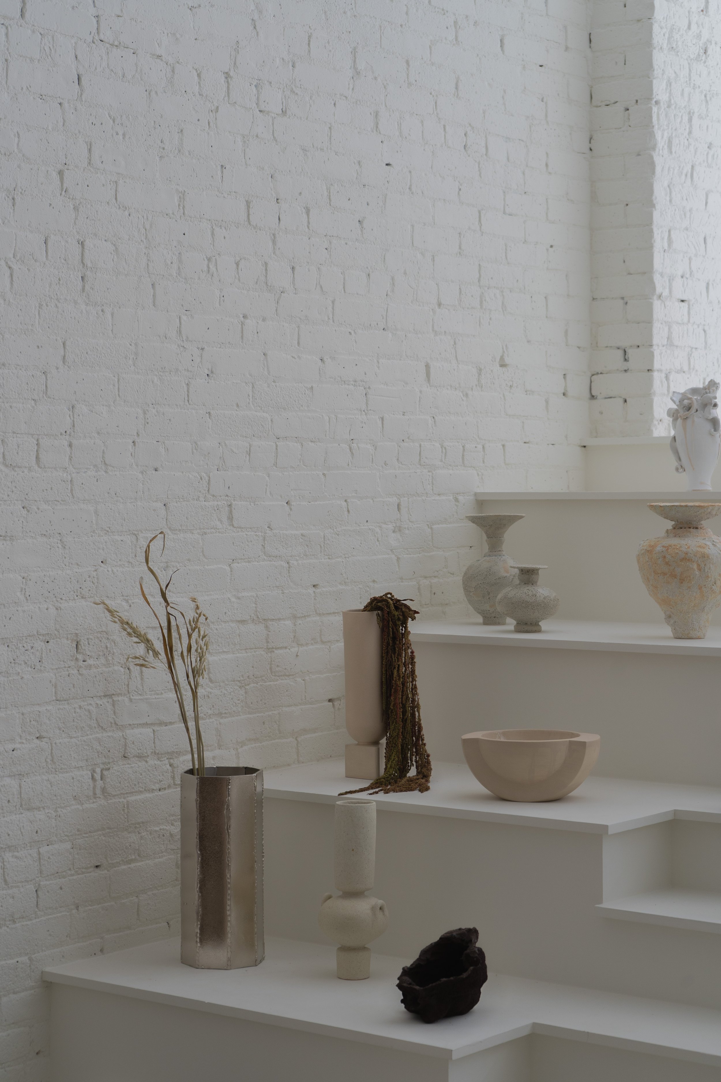
For photography, I used geometry, layering, and natural lighting to harness the feeling of the quotidian in order to eschew the sterility that preponderates contemporary interior photography. I achieved a cultivated lifestyle sensibility through mundane moments, i.e a coffee cup and open periodical on a tabletop, or a jacket strewn on a sofa.
Much of my content strategy came from transposing these visual cues into the narrative.


Frameworks
Simultaneously, I worked to understand how other brands curate content across different platforms and created a graph to pinpoint these differences.
The x-axis speaks to the quality and type of content across different platforms: is copy more technical, factual, and product-focused? Or, is it expository and meandering, referencing culture, design, art, ideas? Voice in the y-axis indicates whether branded content is collective, objective, and 3rd-person, perhaps more passive; or, whether it is familiar, singular, coming from individual creators.
Competitive analysis gave me greater confidence in situating TRNK’s content narratives between Product and Reference. As both a curator and retailer, TRNK balances product copy with journal entries to engage and educate its users.
Organizing content progression meant concretizing the platforms that TRNK offers. It educates through meaningful curation and exposition, so I emphasized the journal as the main channel through which to engage and grow its customer base.
Discovering inspiration
What are some guidelines that TRNK can use when creating content? When considering the didactic, warm, lifestyle qualities embodied by the brand, I thought of the words ‘discovering inspiration’. It’s a broad phrase, but one that I believe encapsulates the lexicon TRNK could use when putting pen to paper.
Discovering inspiration invokes TRNK’s role as a curator: it meanders through the design world, both contemporary and historical, finds noteworthy artists, designers, projects, and ideas, and shares these findings with its customer base. Maintaining both an exploratory and crafted style would best serve TRNK’s many facets.
When brainstorming around the new brand identity, I also thought of the importance of using words that evoked evolution. TRNK was preparing to renew itself in the design world and needed the verbiage to effectively elevate itself.
Discovering inspiration
Meander, explore, discover, inspire, multivalent, ecosystem, ephemeral, revolve, cerebral, evoke
Rebranding
Evolution, beginnings, vernal, foment, contemporary, launch, animate, collect, curate, invoke
Sentence structure
Syntax pulls from the idea of discovering inspiration. Dependent clauses, when used intentionally, feel sophisticated but can also soften assertions and elaborate ideas for more approachable content. The meandering sentence encourages the user to tag along with the narrator.
Pictured: Writing and photography for TRNK.
Instead of:
Fawohodie is the first collaboration between Studio Anansi and TRNK. It draws inspiration from the entangled relationship between traditional African aesthetics and Western modernism.
Use:
Fawohodie - the first collaboration between Studio Anansi and TRNK - draws inspiration from the entangled relationship between traditional African aesthetics and Western modernism.
The interjection of the underlined dependent clause above provides the opportunity for the narrator to pull the user into the story of the collaboration between TRNK and Studio Anansi rather than merely state facts.

Reflection
I laid the foundation for TRNK’s high-level strategy to execute content across its editorial, retail, and social media functions. Content managers could use the language and lexicon to engage users through imaginative, educative copy. My writing for product listings, journal entries, and publicity inspired Tariq and other writers to extrapolate for their own use.
In future work, I would test keywords to see which resonate with users. Which journal entries with specific verbiage capture or convert more users than other entries? And, how might this improve or degrade how users navigate across TRNK’s website and social platforms? In the end, our collaboration was featured in T Magazine and Elle Decor.