


A music player that focuses on autogenerated playlists and multisensory output to enhance discoverability and joy.
Team of One
Roman Meza (Me)
Role
Competitive Analysis
Interface Design
Timeframe
2 Weeks
December 2023
Project
MHCI+D Course
HCID 513: Interfaces Lab
Music Player Teardown + Redesign
Aura is the culmination of a Spotify teardown and redesign through MHCI+D’s Interfaces Lab. The project:
1. Reconsider how users search and browse for music;
2. form a distinct and compelling visual identity that considers what makes for good software and blends with the art and photography of music acts; and,
3. apply the metadata that already exists in new and creative ways.
Spotify Teardown
Strategy
Spotify succeeds architecturally: its main navigation feels intuitive, reflecting how people might listen to and organize their music day-to-day.
Home, Search, and Your Library relate to exploring new music, locating specific media, and browsing Liked and Saved music; though, Search in the main navigation could be consolidated into Home as an icon.
Spotify does well at recommending new music through Song, Artist, and Album radios as well as features in the Home and Search menus that inject interactive moments pulled from multimedia.
Usability
There is sufficient color contrast between black, green, and white, but low contrast between black and grey fonts. The main navigation menu has icons of about 48 x 48 pixels.
What also has poor accessibility is the small font during many parts of the navigation process. The Home screen is replete with tiny typeface in subtitles and filtration, and most icons are only 24 x 24 pixels.
Spotify does fairly well visualizing information. Media tiles, whether they be a song or an artist, change from a circle for an Artist to a Square for albums.
Desirability
Spotify’s black, green, grey, and white color scheme succeeds because it allows the media to shine.
The branded green is rich enough to inject playfulness into the visual landscape while acting as a sufficient identifier for its features.
Spacing feels organic and spacious. Icons don’t feel cluttered, and they’re large enough to tap.
There’s playfulness incorporated in the rounded edges in tiles, buttons, and line terminals instead of sharp edges that would have imposed rigidity.
Information Architecture
The first step in my redesign was to restructure the music player. Initially, this looked like consolidating Spotify’s Home and Library into Library to simplify the user’s vast repository of media into one location. I also replaced Search with Browse because I felt that this familiar language would evoke a more lackadaisical sensibility.
Spotify’s algorithms for curating and recommending work well to find new music for the user, so I wanted to enable even greater discoverability through Make in the main nav. While users could continue to make Playlists, I also wanted to emphasize artist, song, and playlist Radios because of the opportunity to churn even more discoverability and joy.
Moodboard
Two moodboards communicate a refined, emotional, and intelligent feel for the new music player. I appreciate the club feel evoked by Spotify’s aesthetic, but I also wanted to lean into abstraction.
Mockups: Search
The first series of screens shows the user's Search journey.


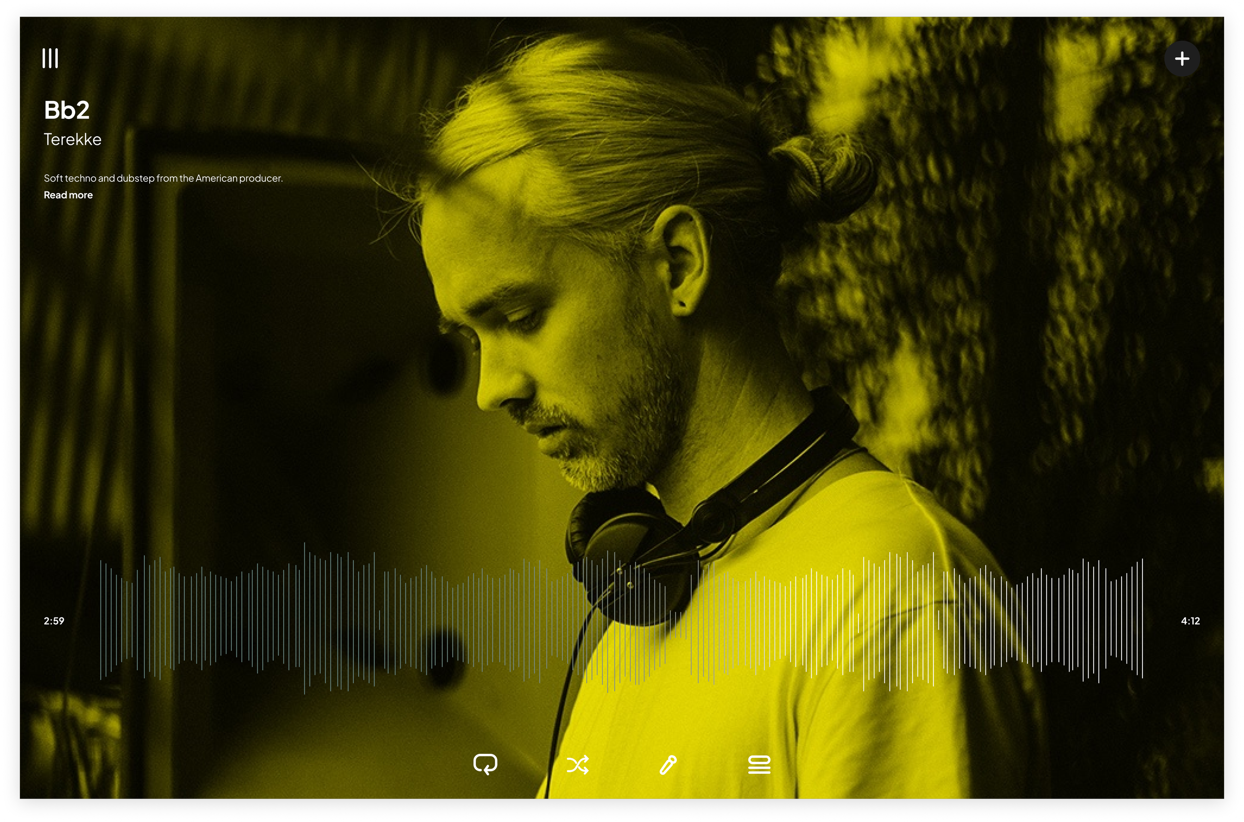
Mockups: Playlist
The second series of screens shows the user Playlist journey.


Specifications
The final project brief highlighting rationale, strategy, style, and design system.


Reflection